Giana
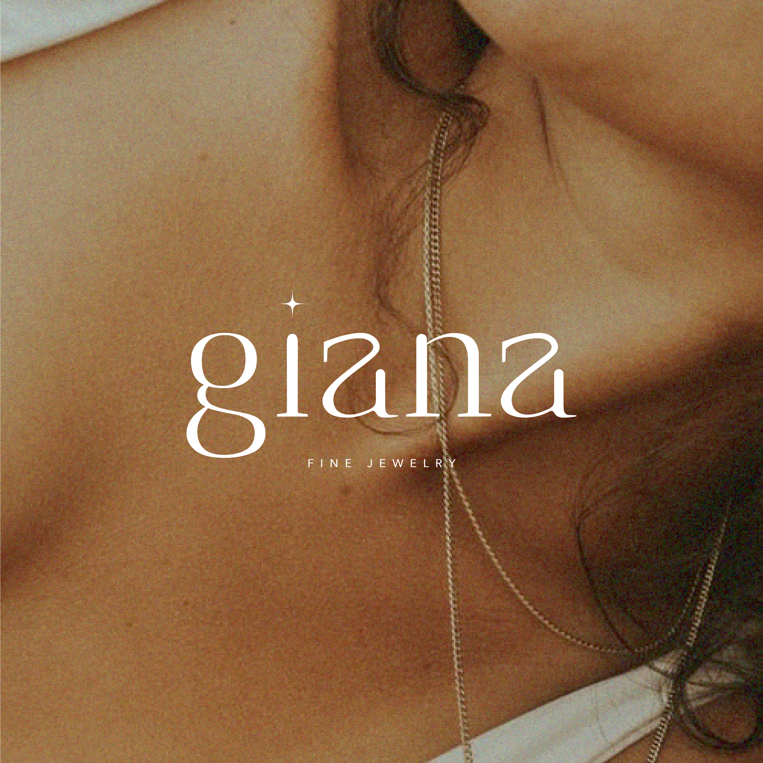
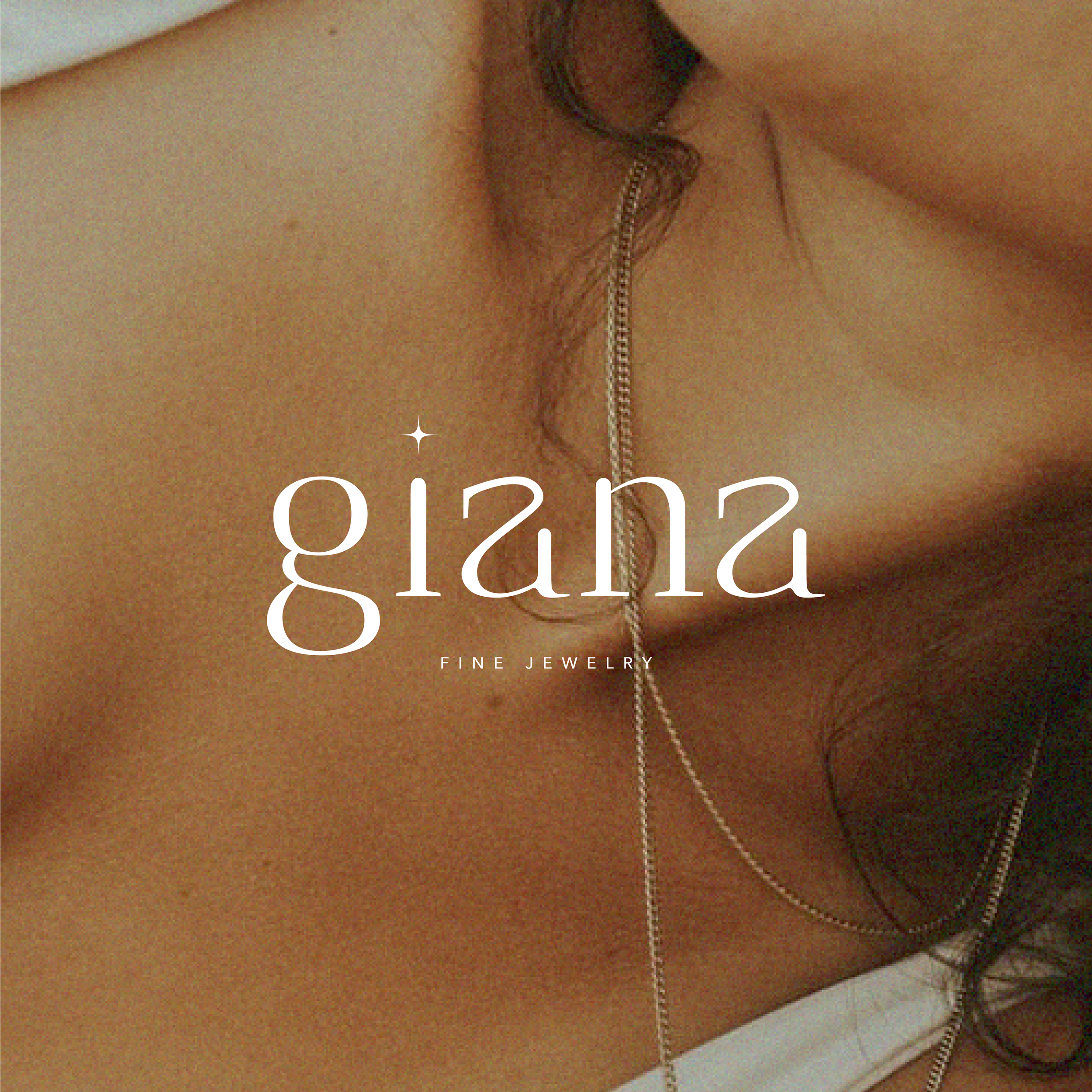
Giana is a conceptual jewelry brand centered on elegance, warmth, and everyday luxury. The visual identity was designed to balance the delicacy of fine jewelry with a sense of warmth and approachability, creating a brand that feels refined without becoming overly formal.
The identity brings together a minimalist typographic logo, a celestial-inspired symbol, a soft color palette, and an editorial approach to imagery. Together, these elements create a flexible visual system that can move across digital, social, packaging, and physical retail while maintaining a consistent sense of elegance, softness, and light.
The visual direction for Giana draws from the qualities associated with fine jewelry: soft light, subtle sparkle, and warmth. Rather than relying on traditional luxury aesthetics such as high contrast typography, the identity takes a quieter approach, using generous space, warm neutrals, and delicate imagery to create a feeling of elegance of luxury.
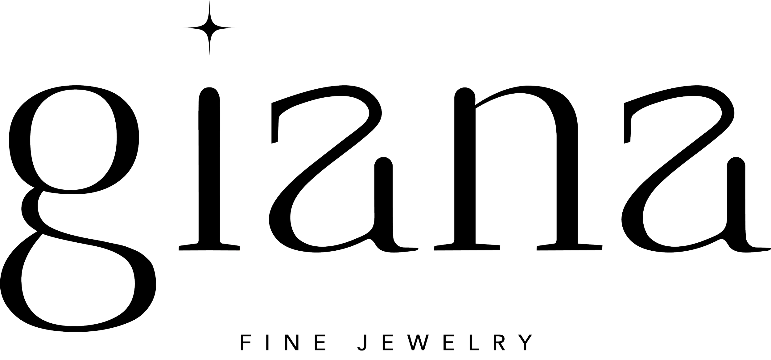


The Giana logo system was designed to provide flexibility across different brand applications. The primary wordmark establishes a recognizable identity, while the accompanying celestial symbol introduces a subtle visual reference to the sparkle and luminosity of jewelry. A simplified mark allows the identity to remain recognizable in smaller or more compact applications.
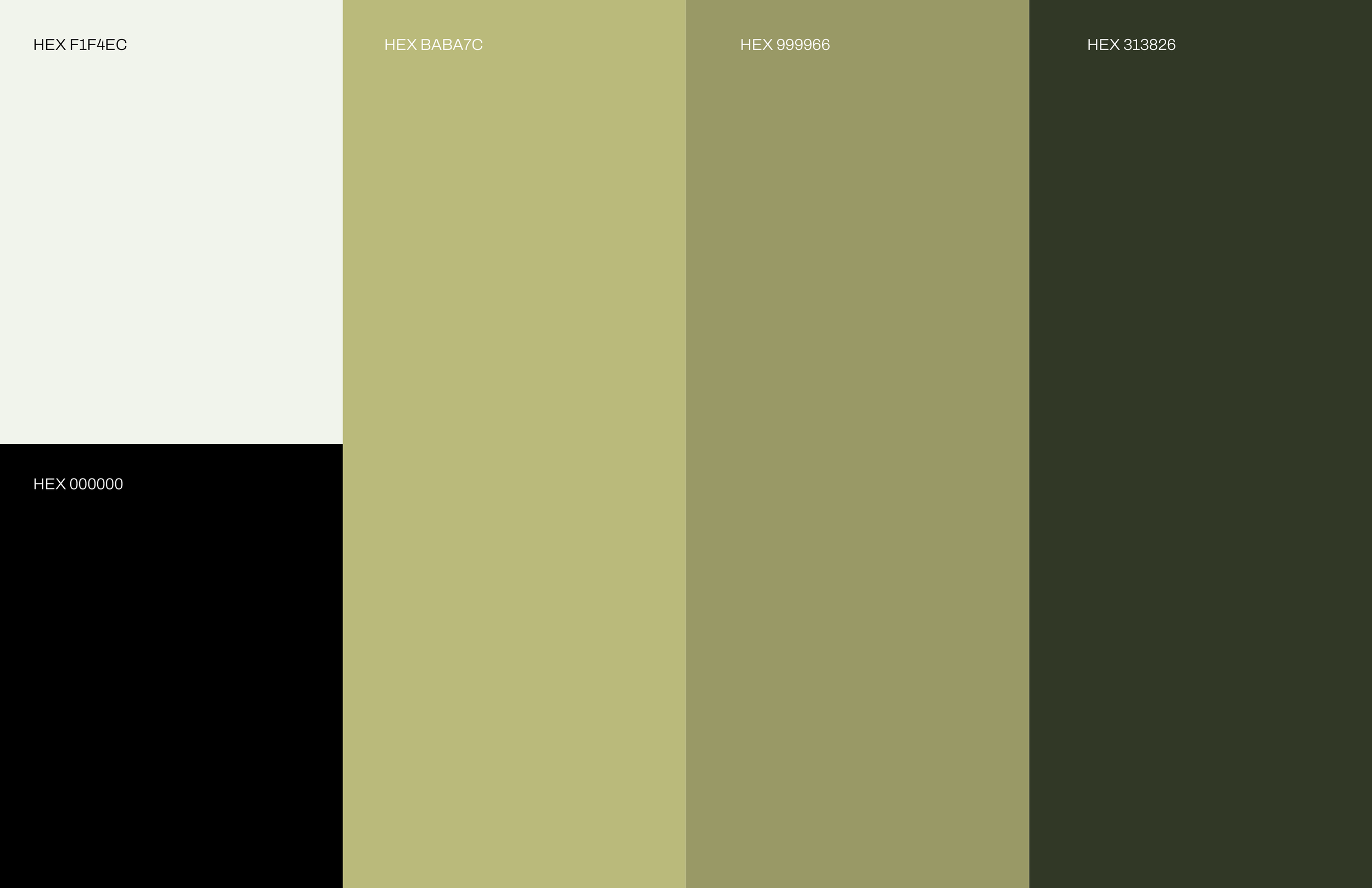
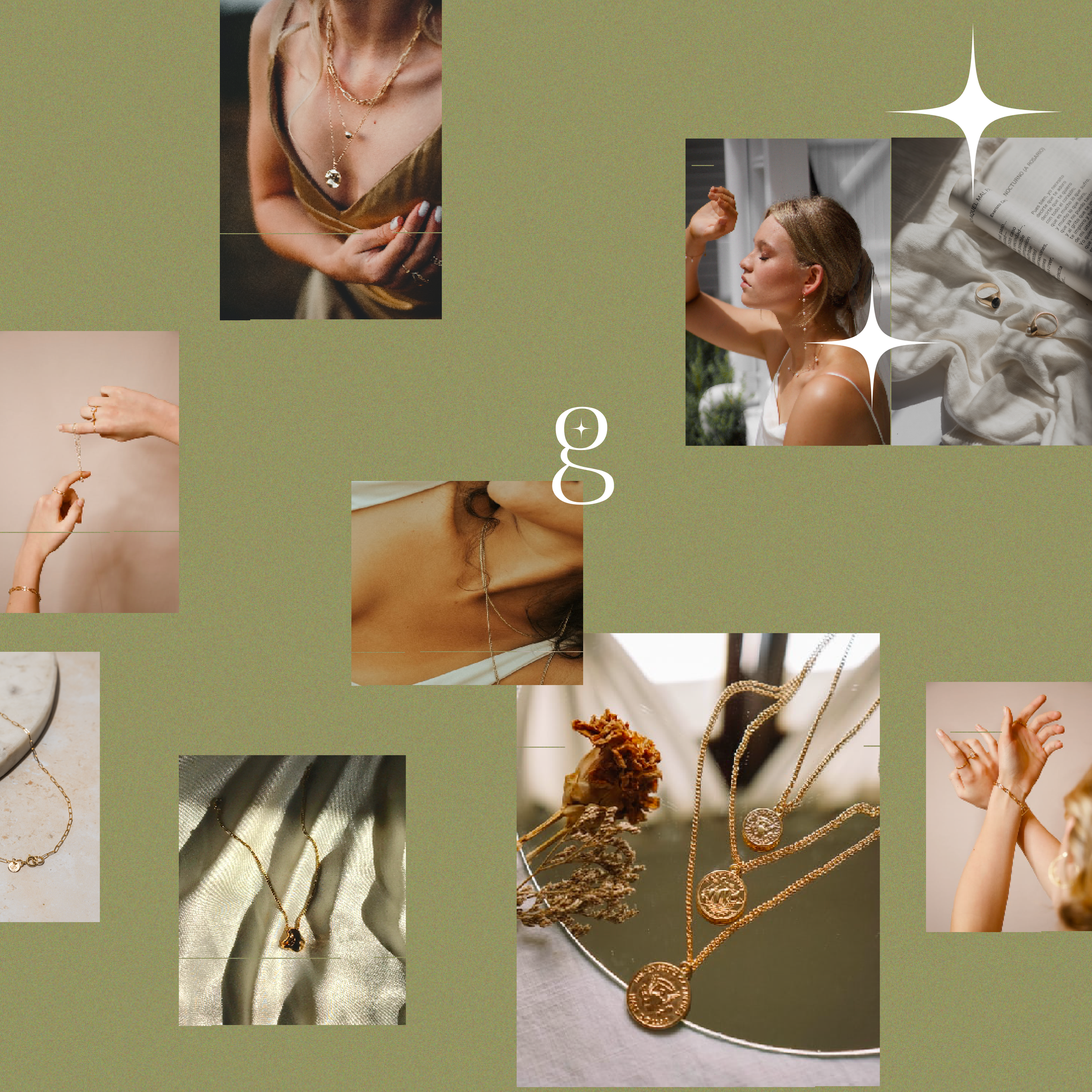

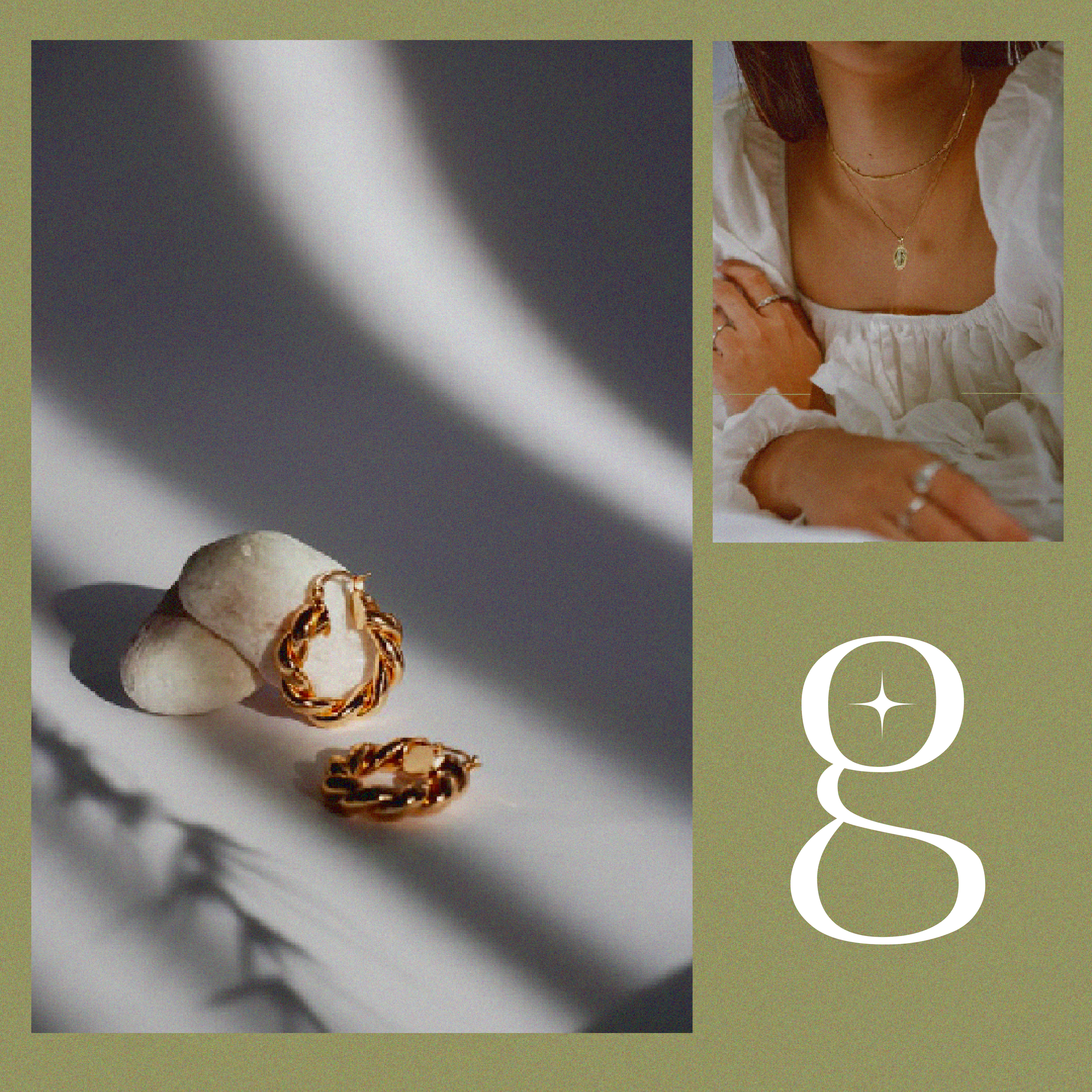
The color palette uses warm, earthy tones to create a sense of luxury without feeling overly formal or cold. Paired with soft, editorial-inspired photography, the palette gives the brand a visual language that feels intimate and tactile. The restrained use of color also allows the jewelry itself to remain the focal point, while maintaining consistency across social, digital, and physical applications, creating a consistent visual atmosphere across the brand.
The identity was extended across digital touchpoints with an emphasis on consistency and hierarchy. Social content uses the established palette, typography, and imagery to create a cohesive feed, while the website carries those same elements into a more immersive brand experience.
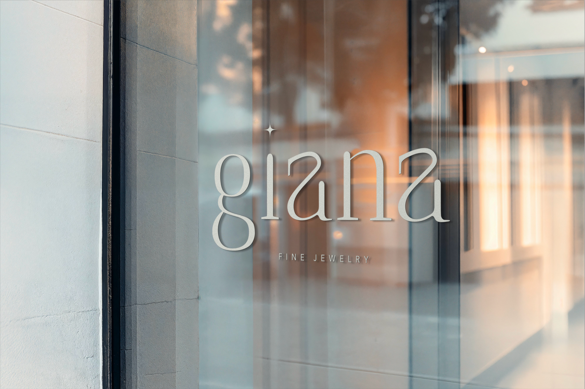
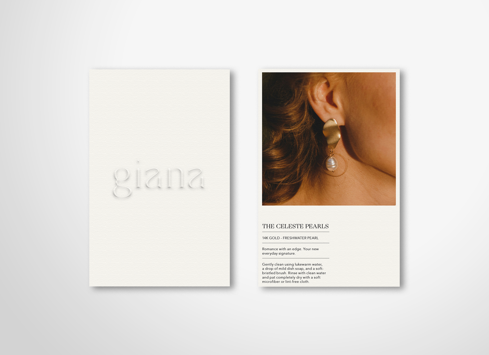
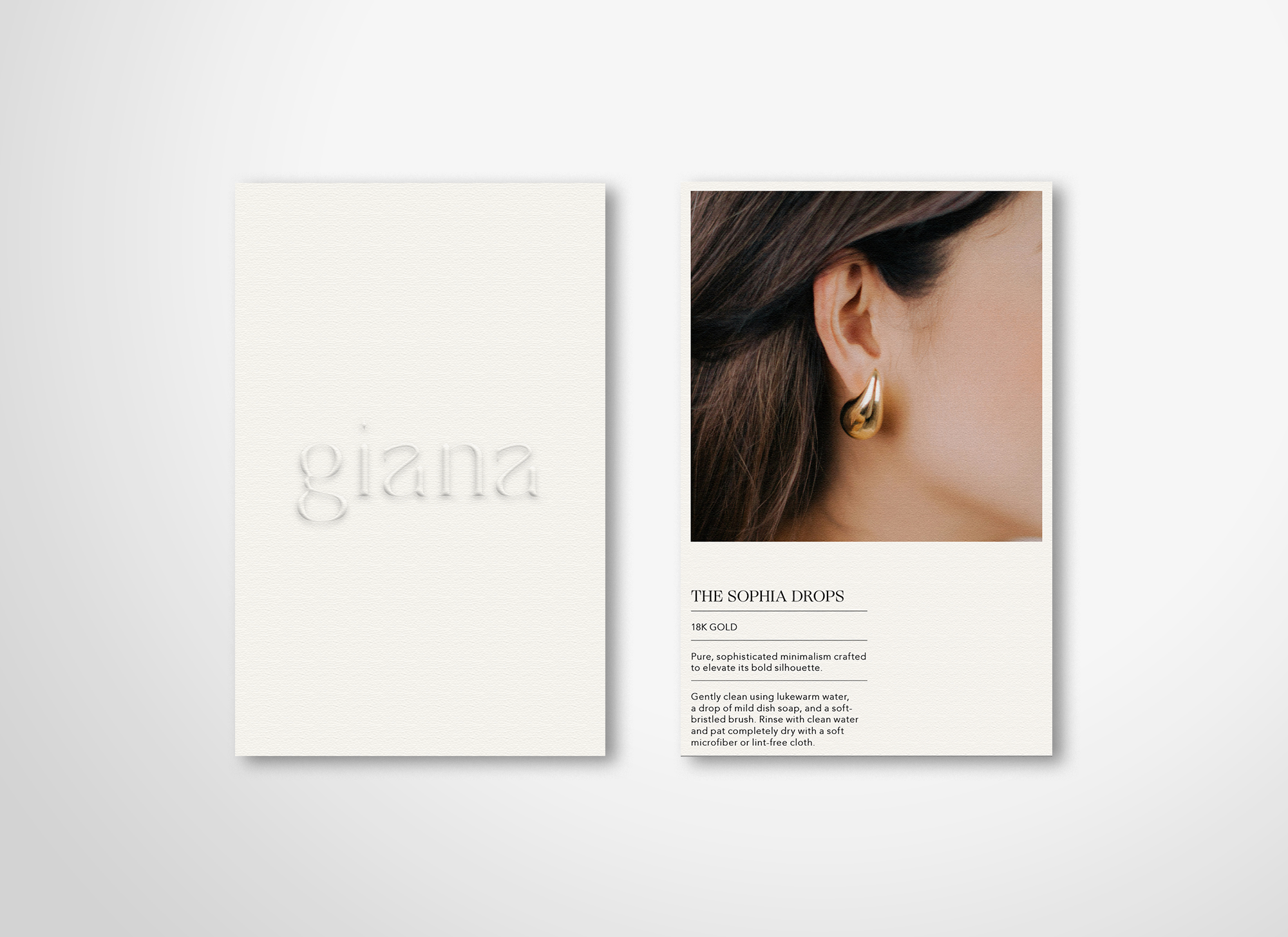
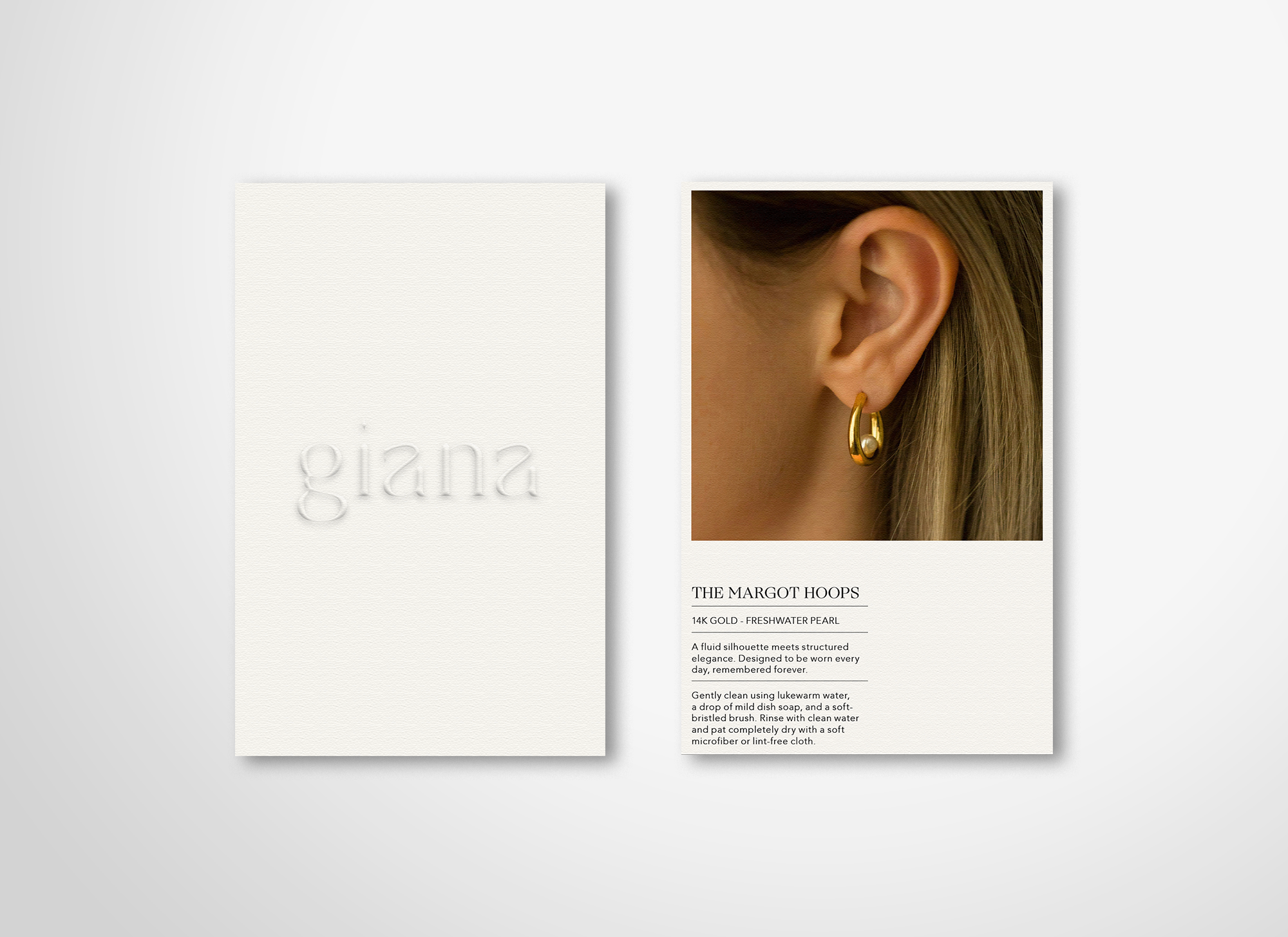
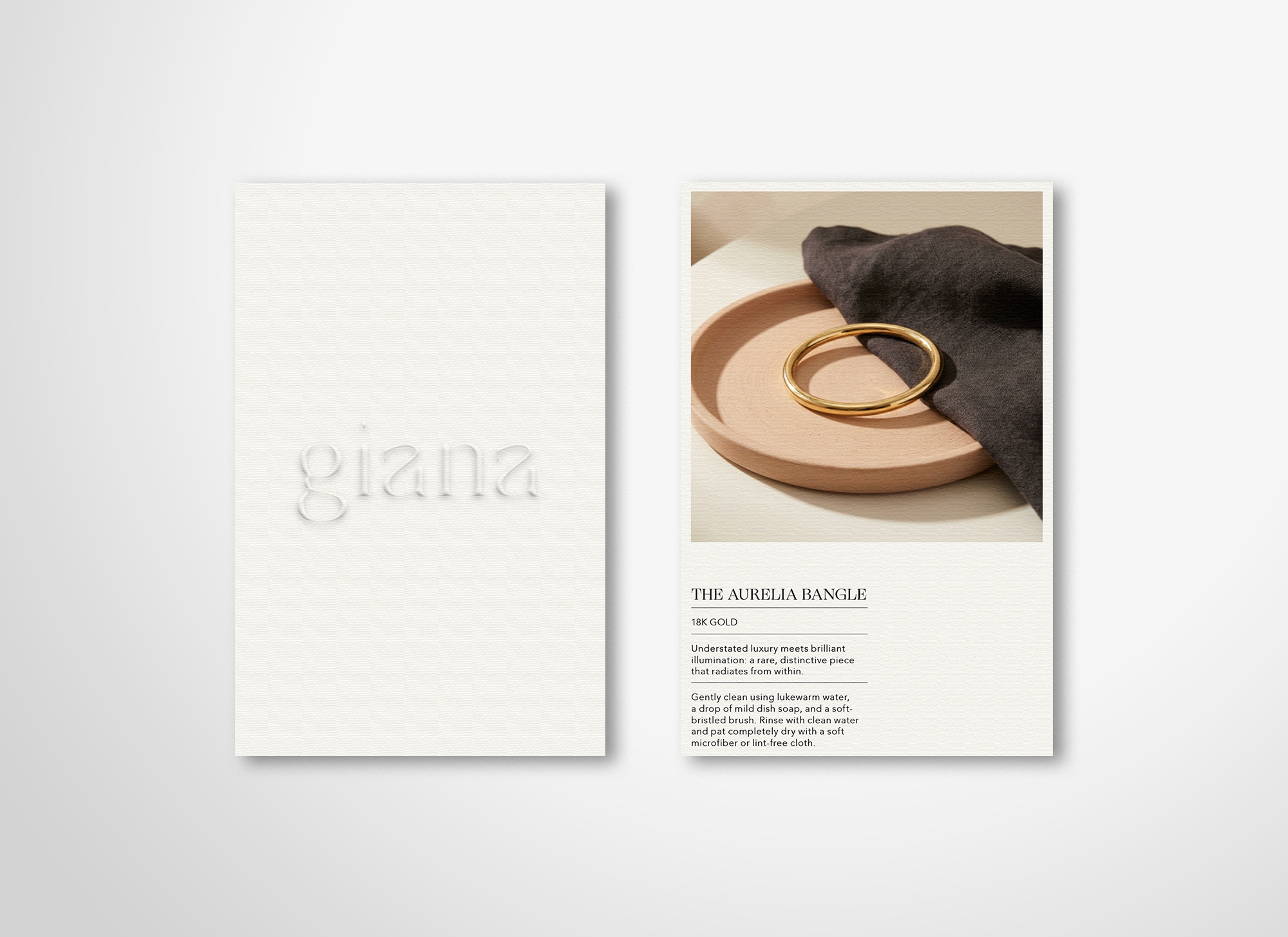
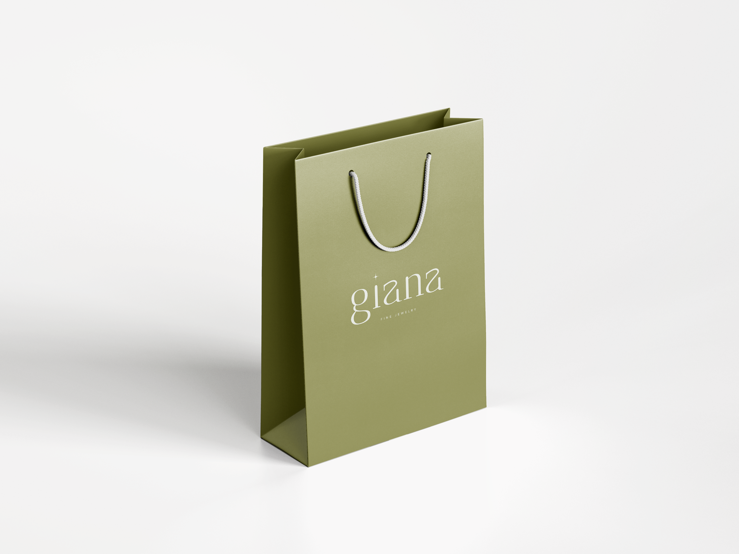
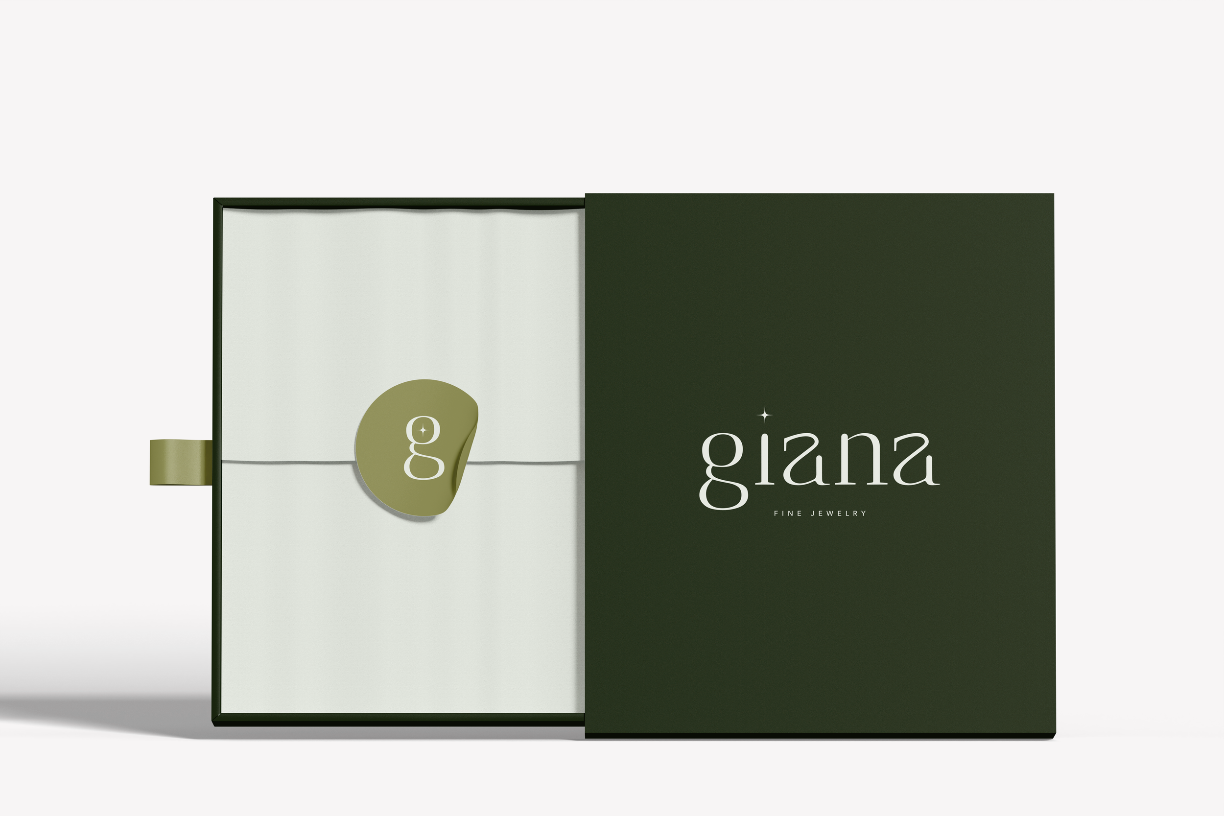
Across physical touchpoints, the identity was designed to create a consistent and considered brand experience, from the storefront and in-store signage to packaging and printed collateral. The same typography, warm palette, and celestial mark carry through each application, creating a cohesive visual language that connects the physical shopping experience with the wider Giana brand.
Giana's visual identity brings together a flexible logo system, warm color palette, editorial imagery, and considered applications across digital and physical spaces. The resulting identity is designed to feel quietly luxurious, contemporary, and cohesive, while leaving room for the jewelry itself to remain at the center. This project gave me the opportunity to explore how simplicity, typography, imagery, and color can work together to create a sense of luxury without feeling overly formal. Extending the identity across social, digital, print, packaging, and retail applications pushed me to think beyond individual elements and consider how a brand can maintain visual language across different experiences.
