Her View Film Festival
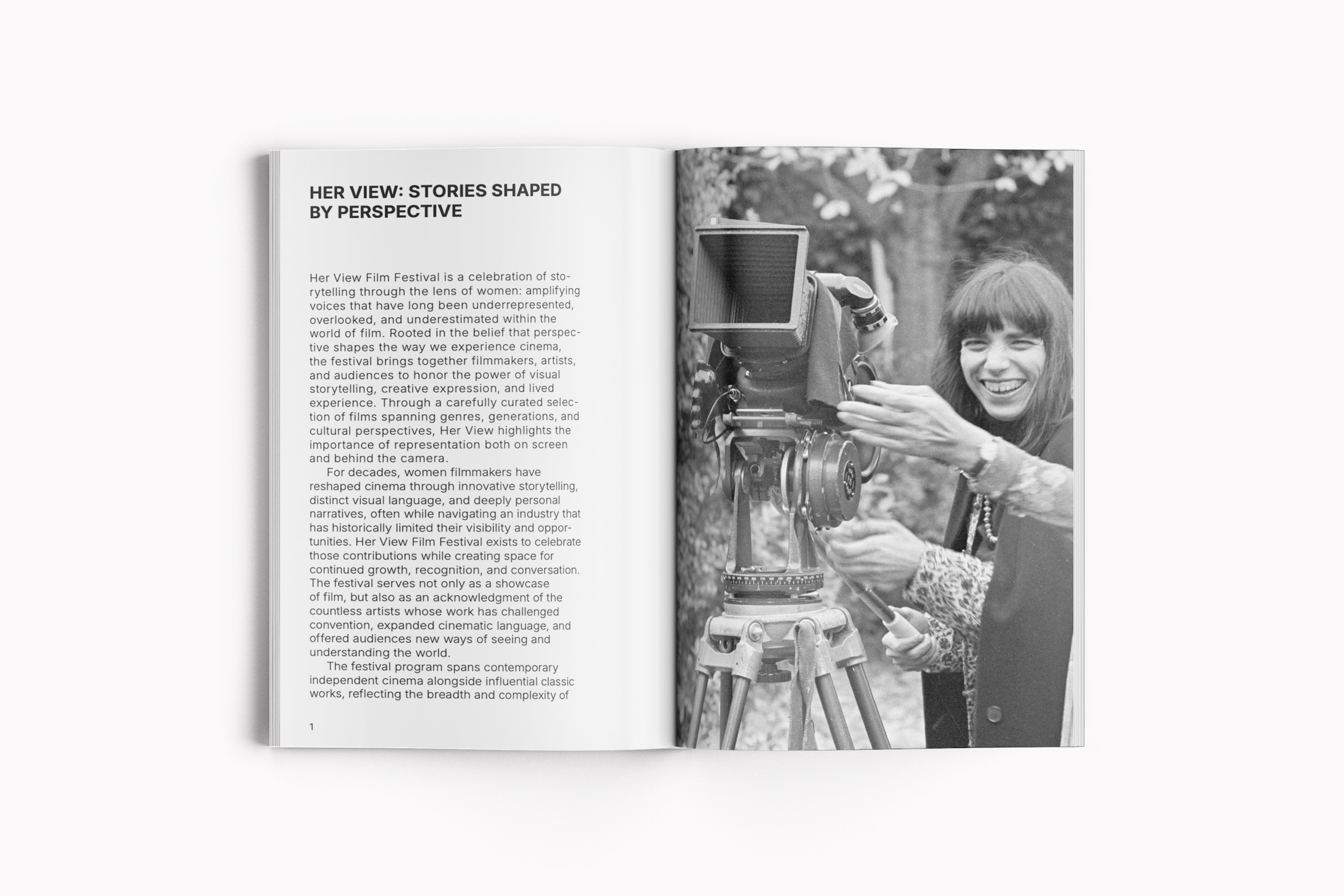
This project is a conceptual editorial campaign for a fictional film festival celebrating women directors across contemporary and classic cinema, called Her View Film Festival. It explores how typography, imagery, and layout systems can create a cohesive visual identity across posters, social media, and festival materials. Inspired by independent film culture and editorial design, the identity balances cinematic imagery with structured, minimal compositions. The visual system draws from archival film photography, high-contrast black-and-white imagery, and expressive typographic scale to evoke the atmosphere of independent cinema while maintaining a refined and contemporary tone. Through consistent use of hierarchy, cropping, and negative space, the campaign was designed to feel both curated and immersive across multiple touch points. It emphasizes clarity and visual storytelling, translating a single identity into a flexible system adaptable to both print and digital formats.
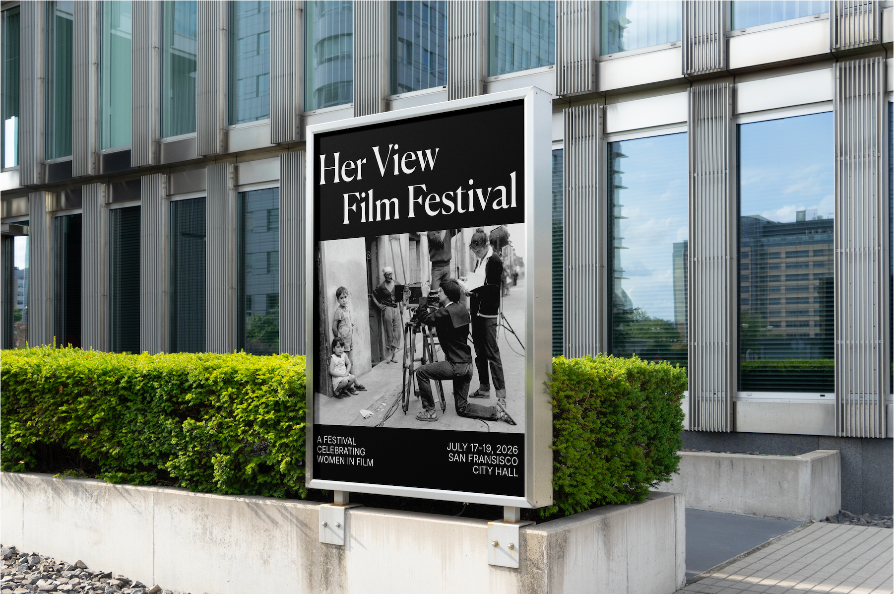
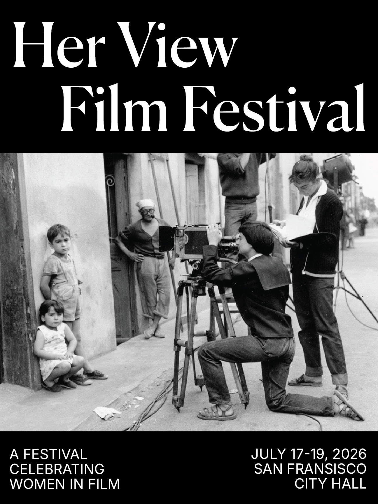
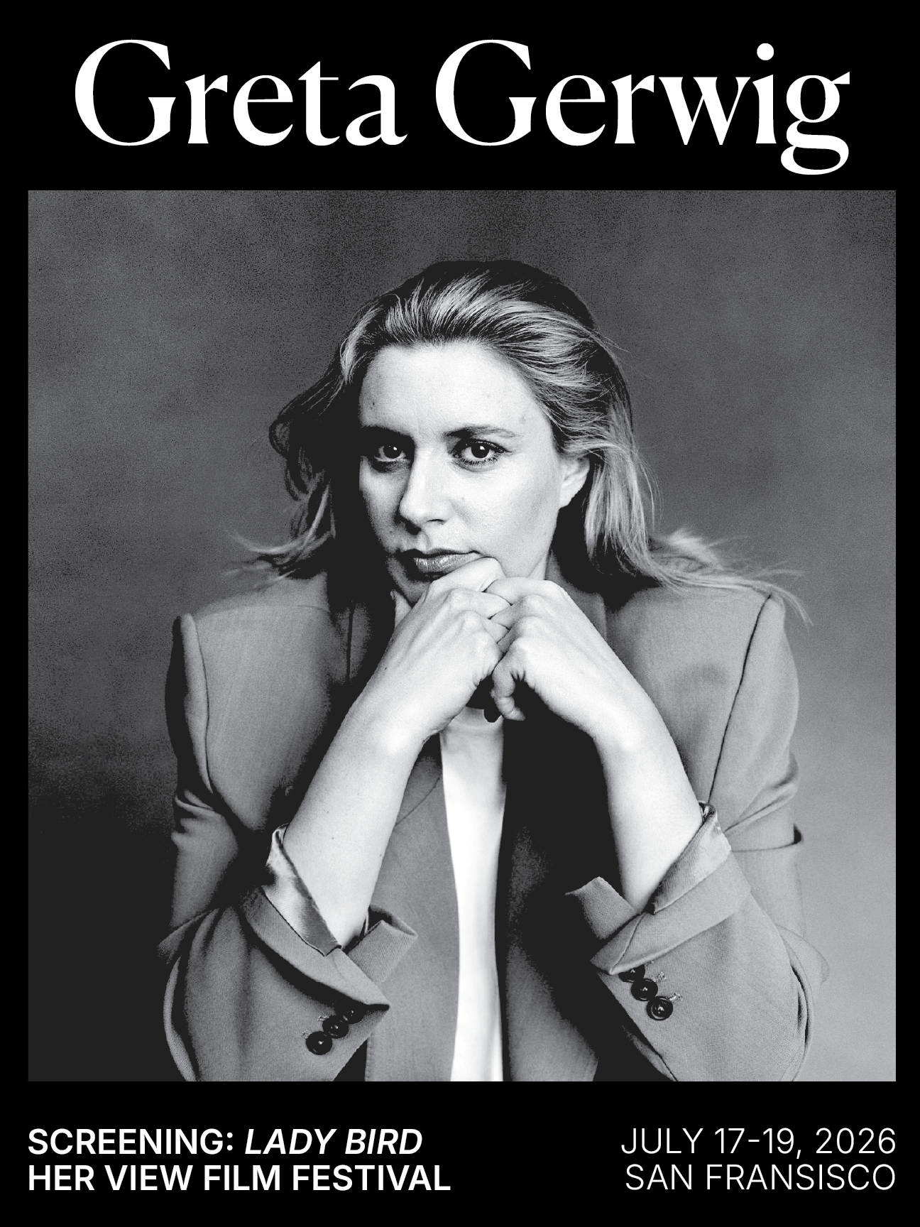
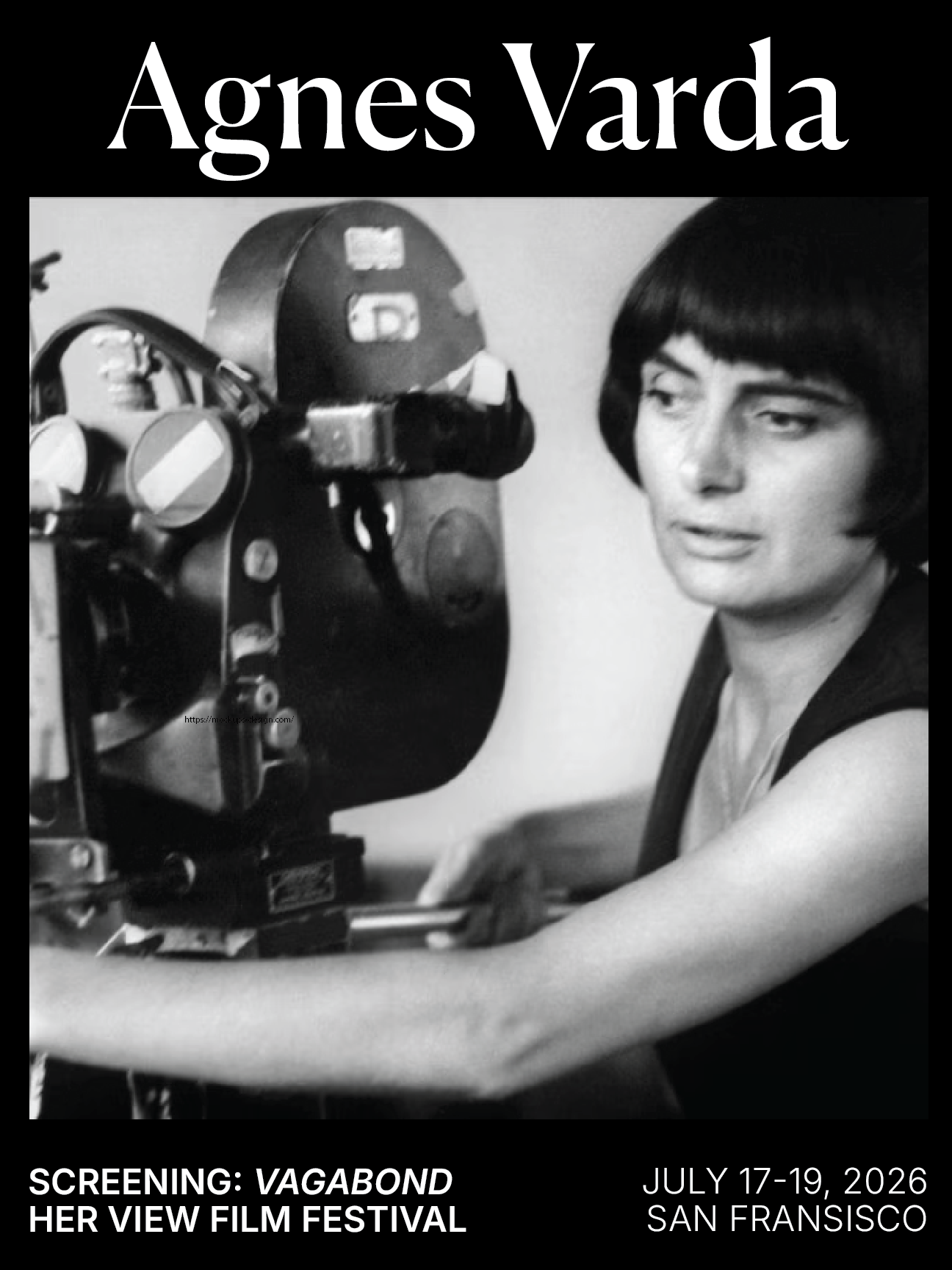
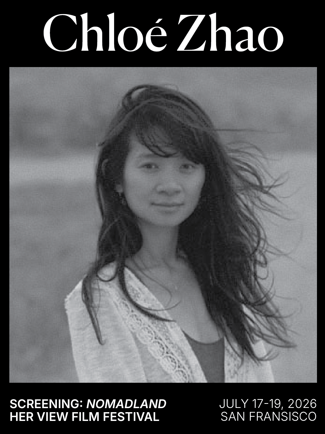
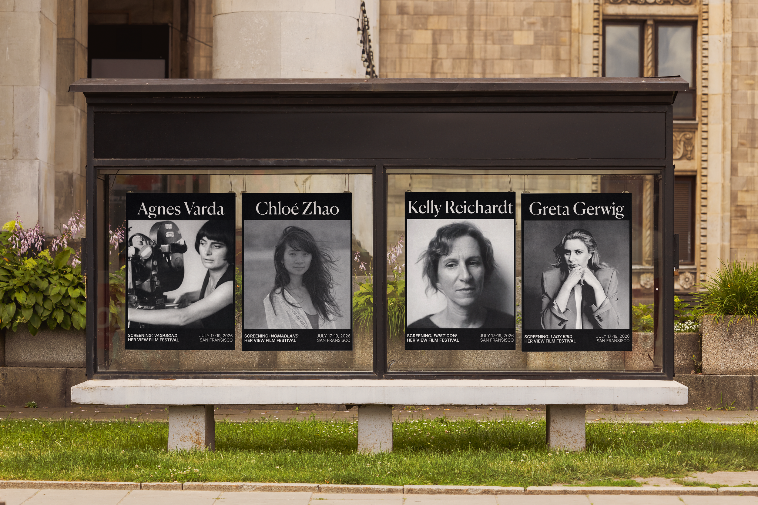
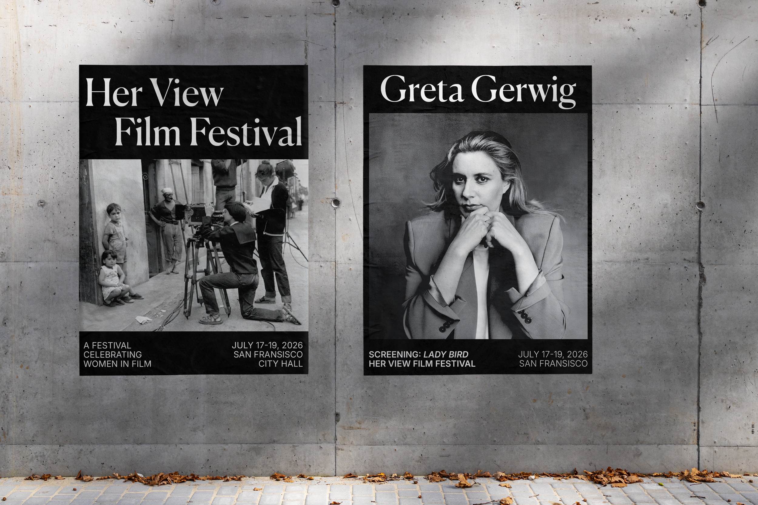
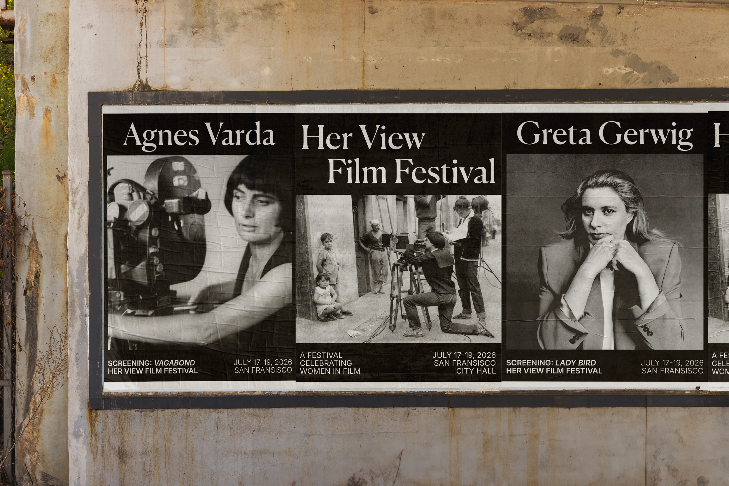
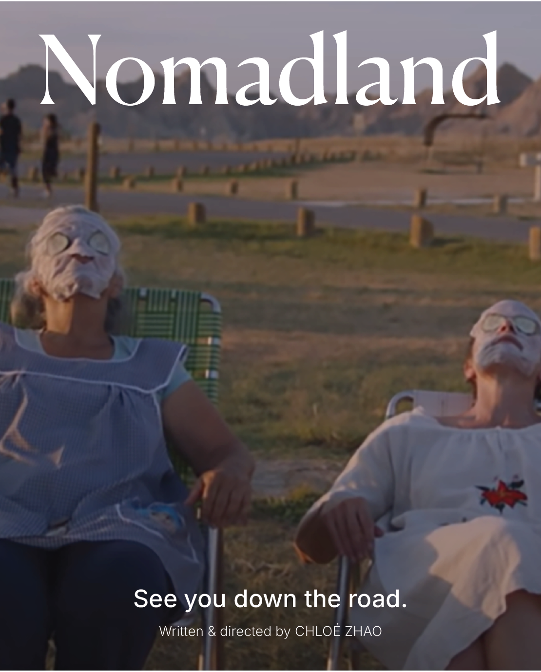
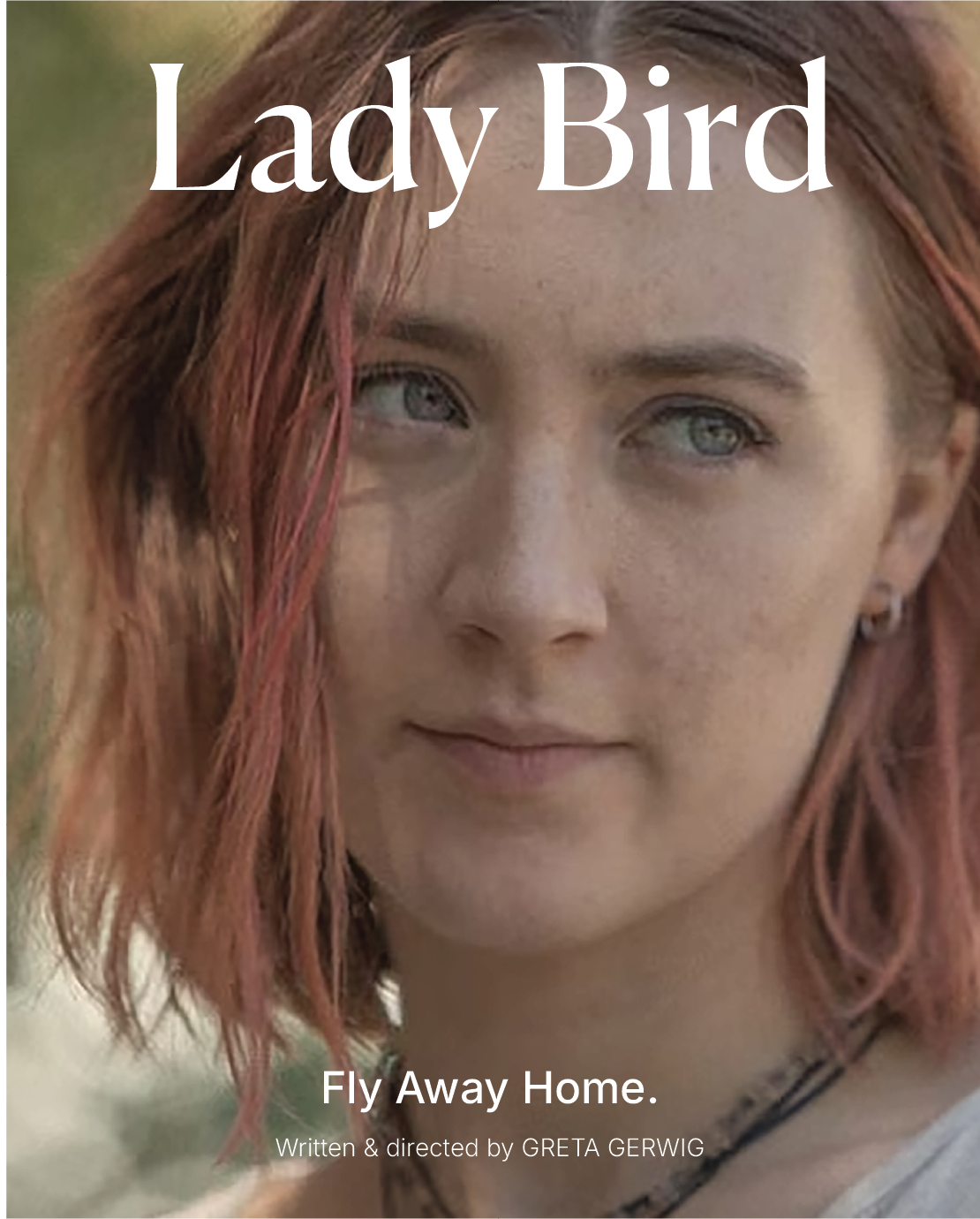
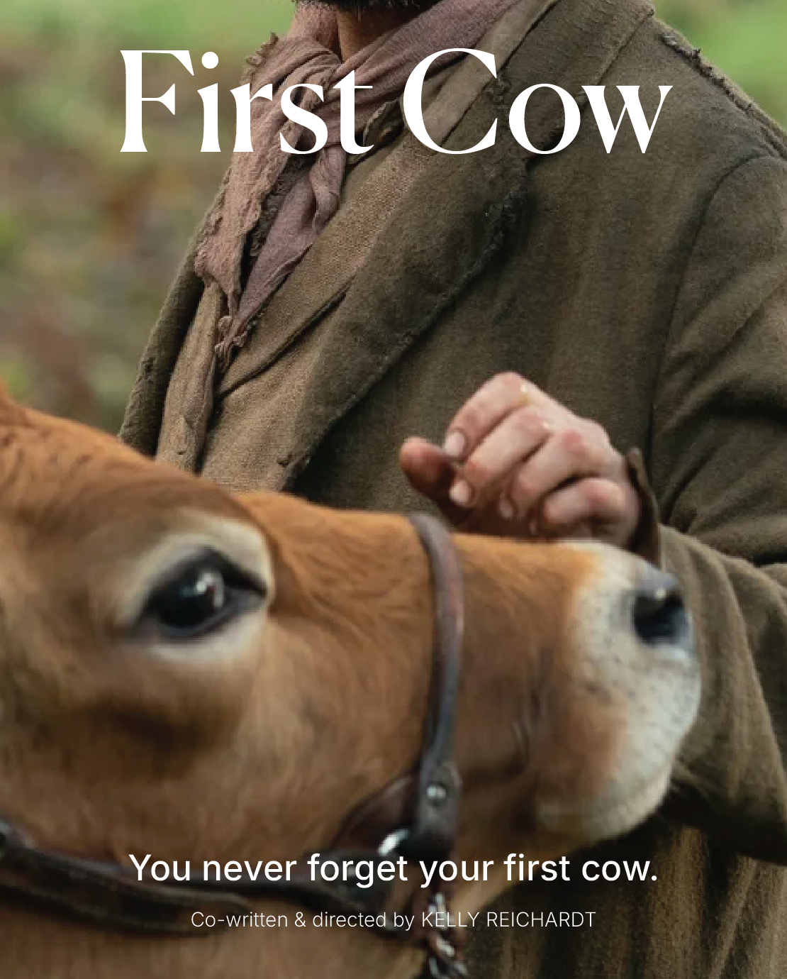
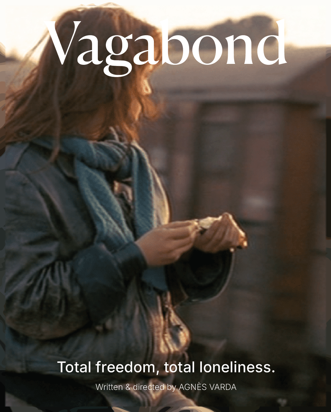
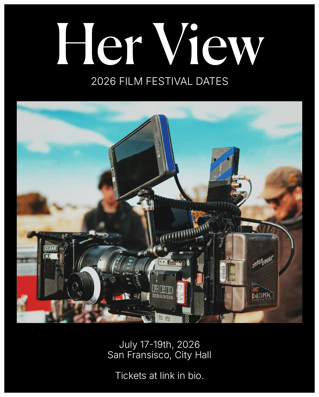
The poster series below serves as the primary visual anchors for the campaign. Each poster was designed to feel bold and cinematic while remaining grounded in a clean editorial structure. Large-scale typography and imagery was used to establish hierarchy, drawing inspiration from both independent film posters and contemporary cultural branding.
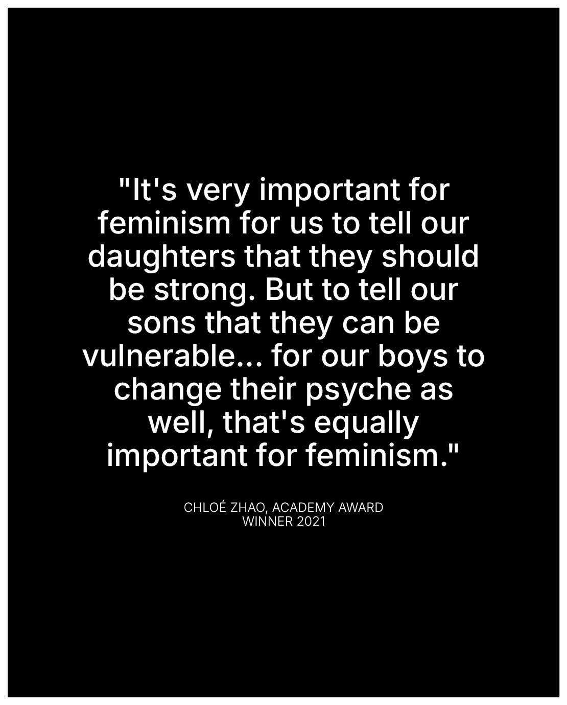
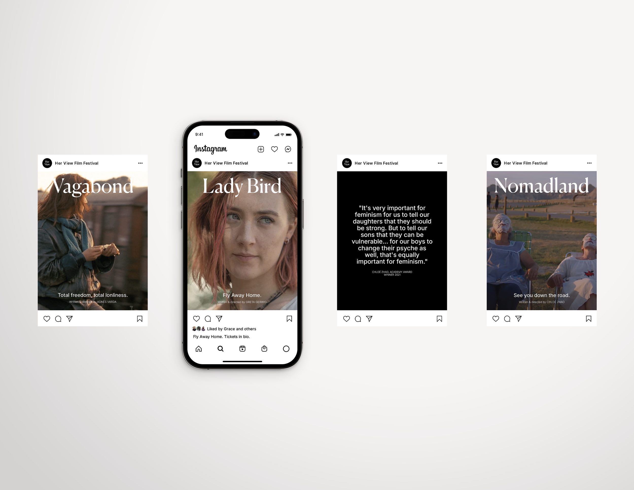
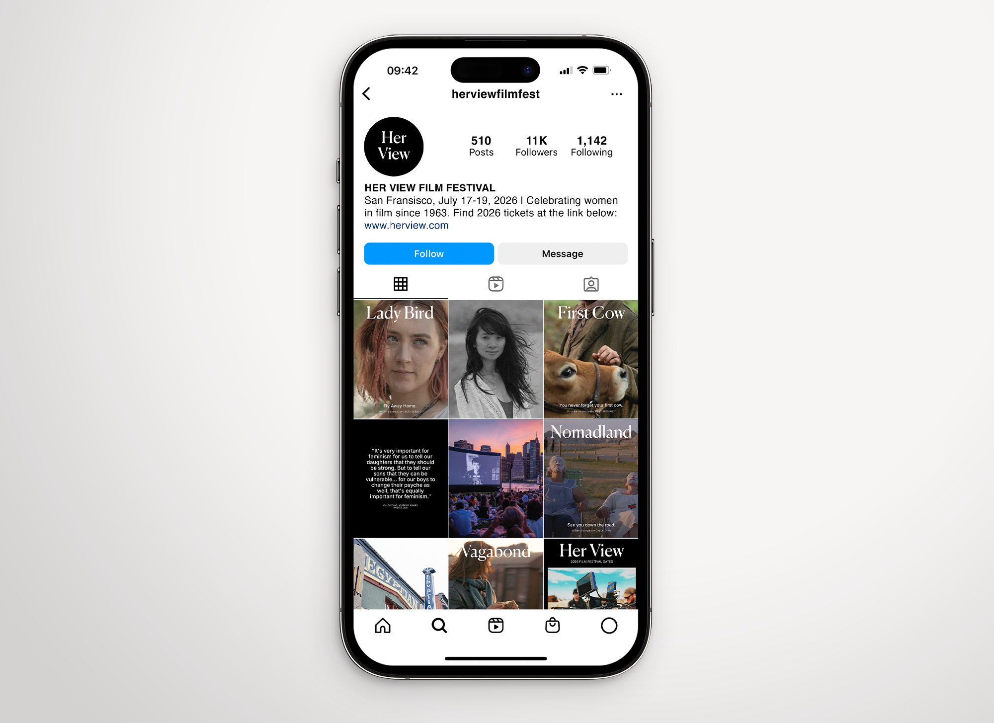
The social media assets were designed as an extension of the core visual identity, adapting the campaign for a digital environment while maintaining consistency with the printed materials. The focus for this portion of the project was to translate the same editorial tone and cinematic atmosphere into smaller formats without losing clarity or recognizability. Using repeated typographic treatments, images, and consistent spacing systems, the layouts prioritize hierarchy and readability while still maintaining a visually immersive quality appropriate for a film festival campaign. The social assets also allow the identity to become more dynamic and interactive, demonstrating how the system could function beyond only print applications.
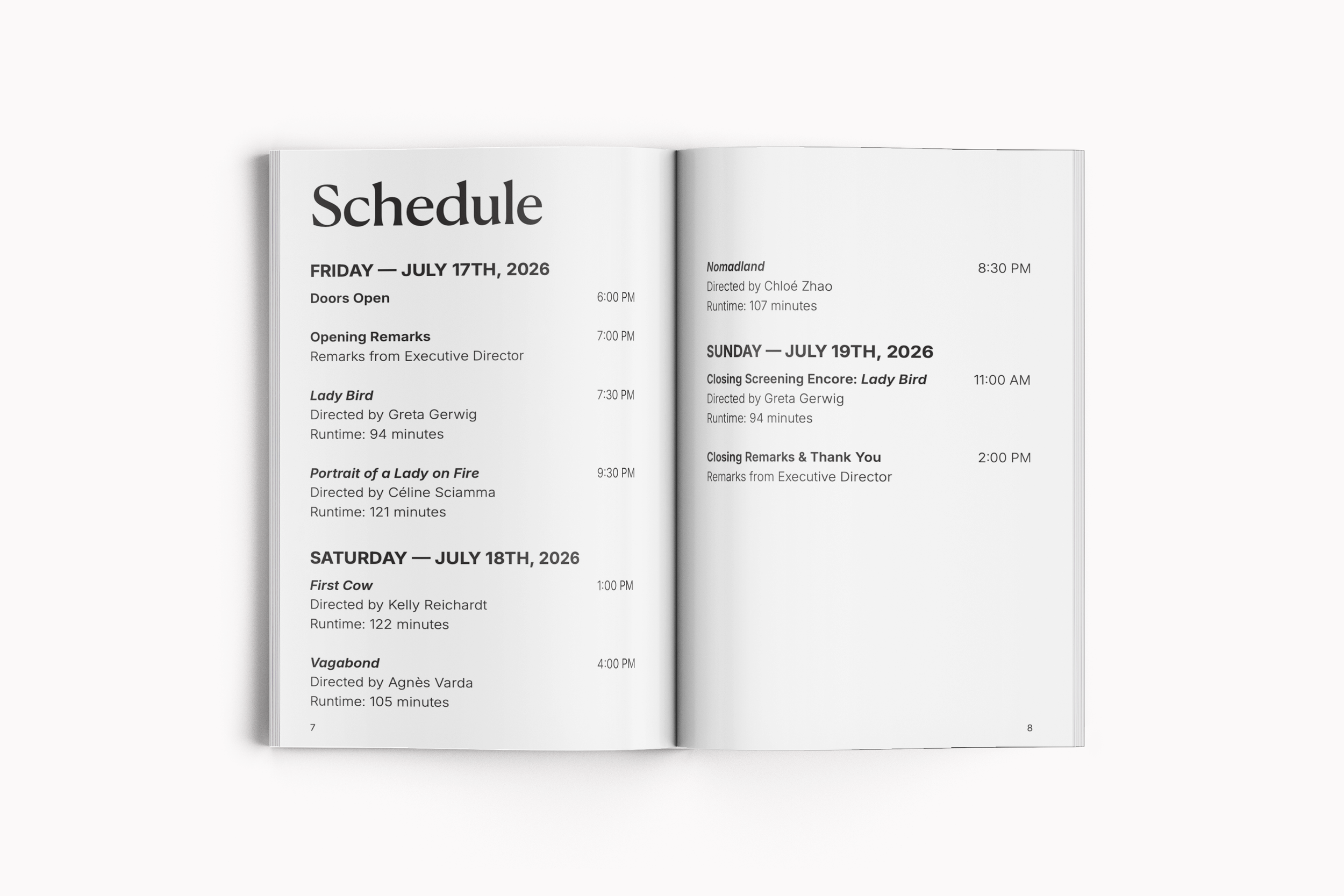
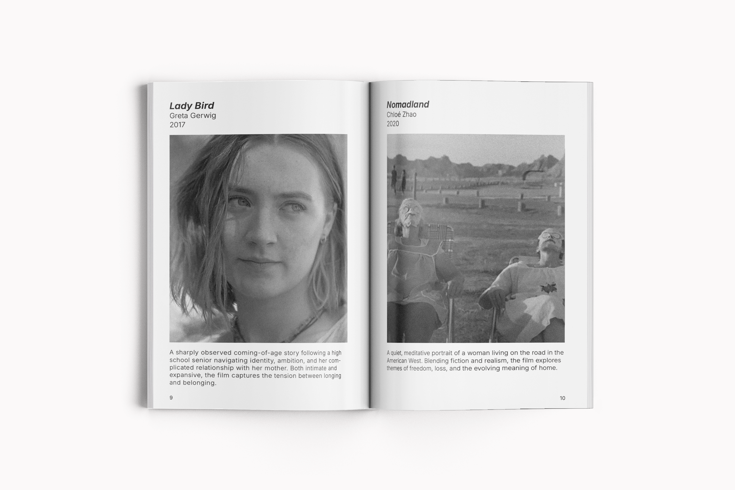
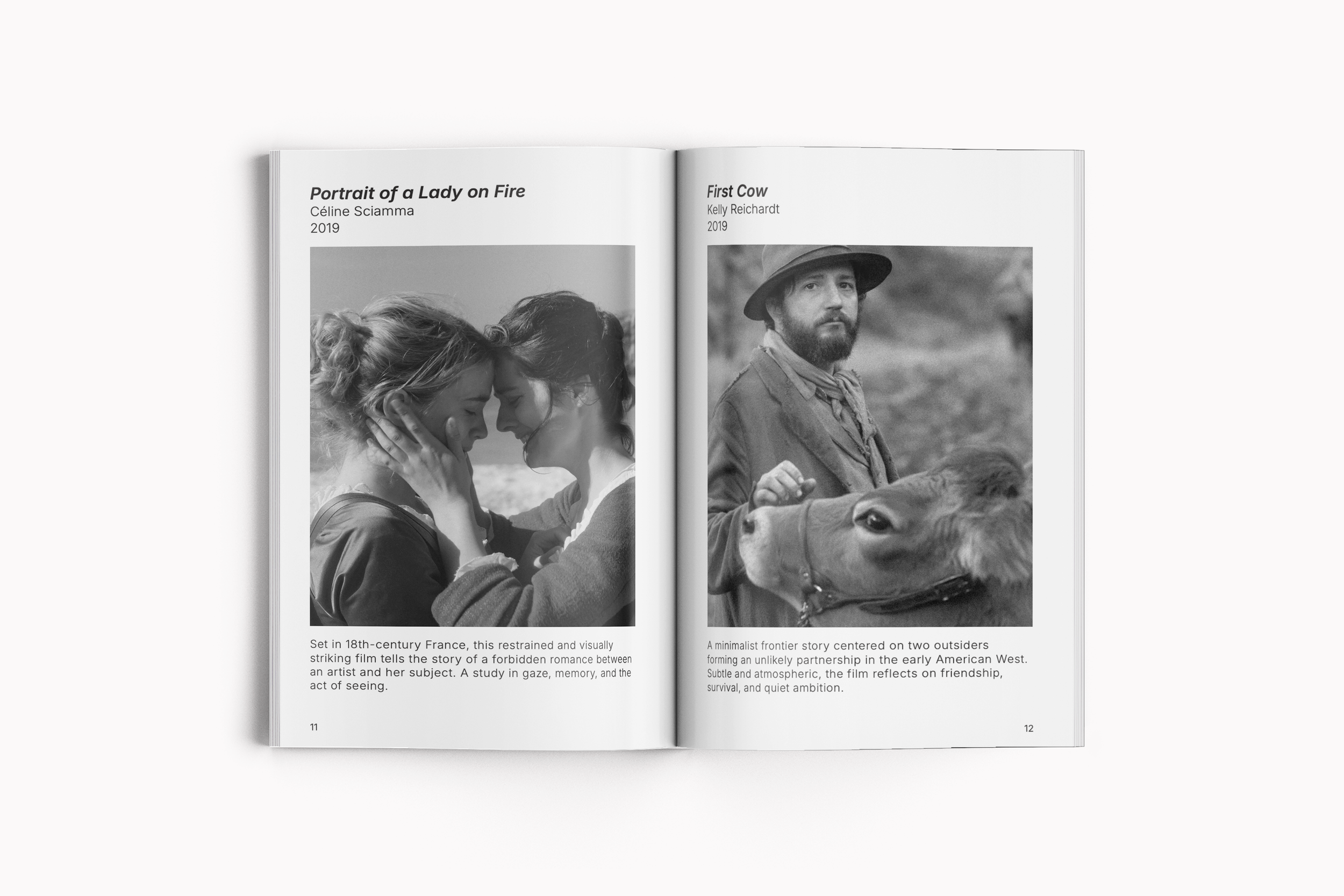
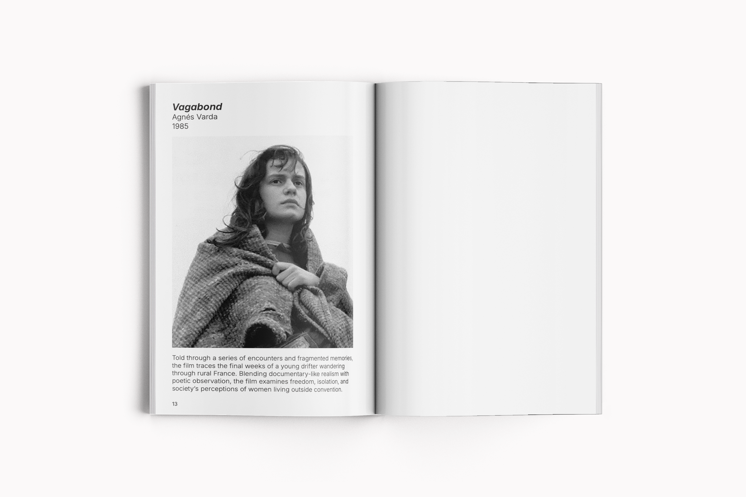
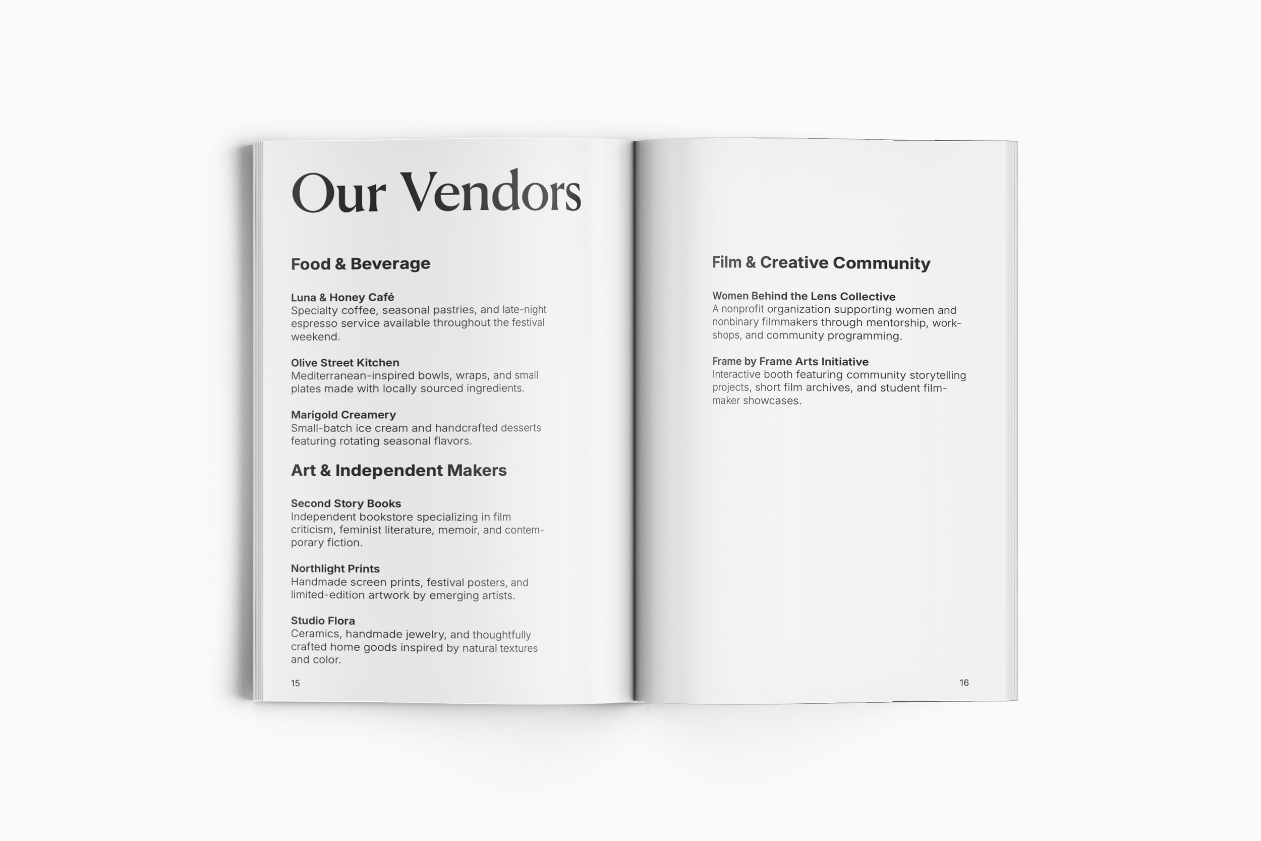
The festival booklet further expanded the identity into a longer-form editorial format. The booklet combines film descriptions, schedules, and festival information within a grid system. Editorial hierarchy played a significant role in this portion of the project. Typography, spacing, and image placement were carefully considered to guide the viewer through the content while preserving the tone established throughout the campaign. The layouts balance informational clarity with visual atmosphere, ensuring the booklet functions as both a practical festival guide and an extension of the overall brand experience. It also became an opportunity to further explore sequencing, rhythm, and consistency across multiple spreads, reinforcing the project’s emphasis on systems thinking and adaptable design.
This project allowed me to further explore branding through the lens of editorial and cultural design while strengthening my understanding of identity systems across multiple formats. Through the development of posters, social media assets, and editorial materials, I focused on creating a campaign that felt cohesive, intentional, and adaptable while maintaining a strong visual voice. More broadly, Her View Film Festival became an exercise in using typography, imagery, and composition to create a visual identity that supports storytelling rather than overpowering it.